

UI
Menu Icon — Cyclic Morph on Hover
Vanilla JSCSSSVG
Previews
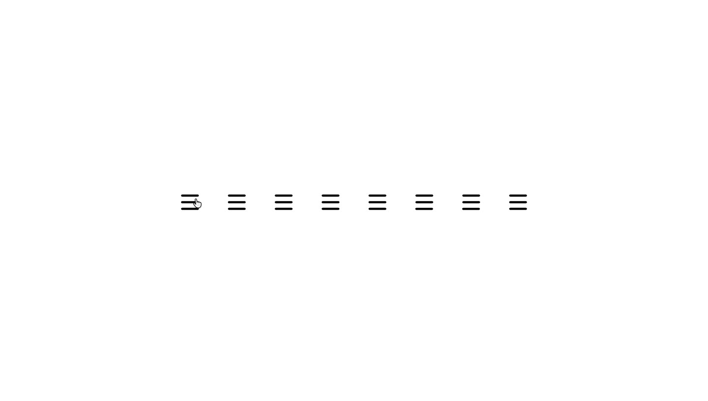
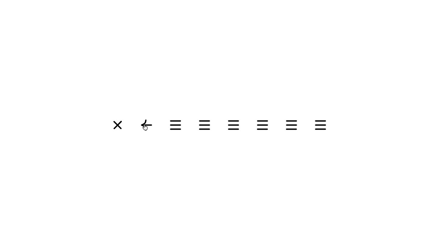
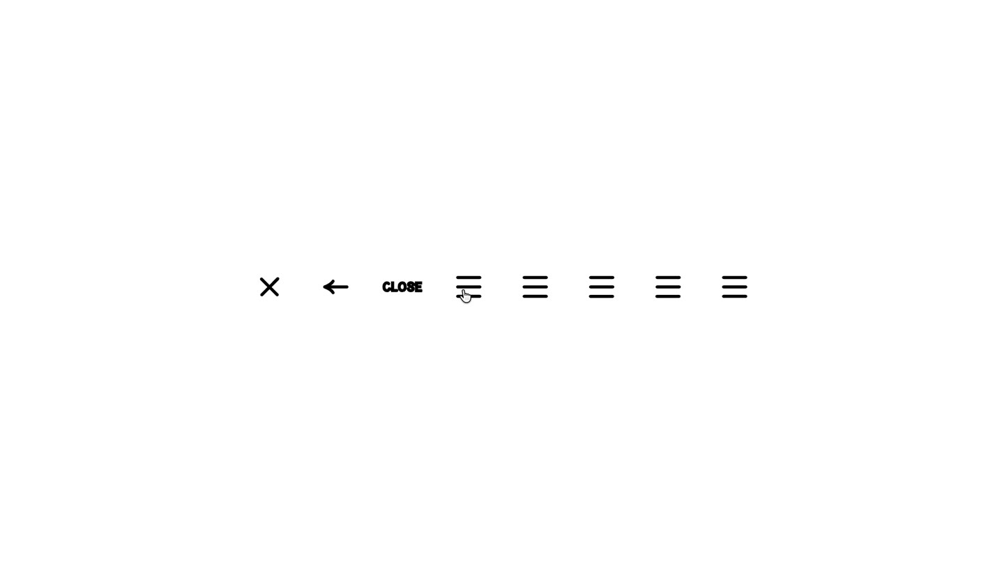
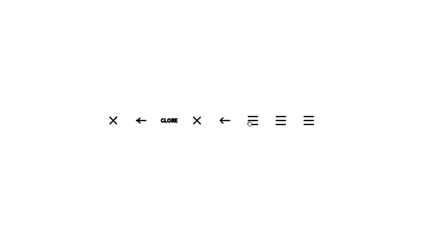
About this build
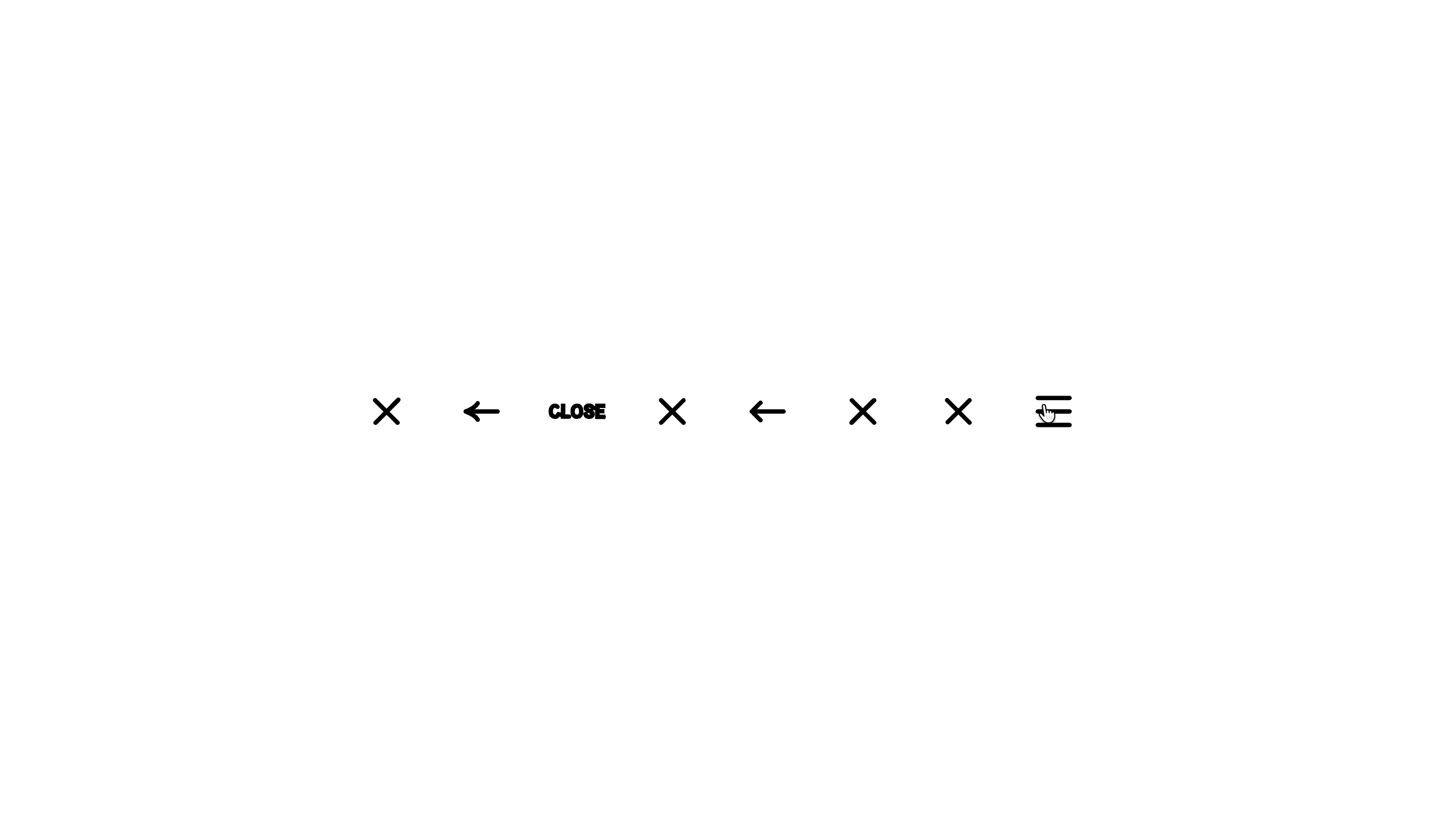
A row of hamburger icons (≡) that morph through a 3-step cycle on hover: ✕ → ← → CLOSE → ✕ → … Each icon tracks its own state independently. State persists after hover, creating a progressive visual trail across the row.
Prompt
Build an animated hamburger menu icon row in Vanilla JS + CSS.

  ## Concept
  A horizontal row of 8 hamburger icons (≡). As the cursor passes over each icon, it morphs to the next state in a repeating 3-step cycle: ✕ (close) → ←
  (back arrow) → CLOSE (text label) → ✕ → ← → CLOSE…
  Each icon tracks its own state index independently. State persists after hover (no auto-revert).

  ## HTML
  ```html
  <div class="icon-row">
    <div class="menu-icon" data-state="0">
      <svg viewBox="0 0 24 24">
        <!-- 3 lines for hamburger -->
        <line class="l1" x1="3" y1="7"  x2="21" y2="7"  />
        <line class="l2" x1="3" y1="12" x2="21" y2="12" />
        <line class="l3" x1="3" y1="17" x2="21" y2="17" />
        <!-- X arms -->
        <line class="x1" x1="5" y1="5"  x2="19" y2="19" />
        <line class="x2" x1="19" y1="5"  x2="5" y2="19" />
        <!-- Arrow back: shaft + head -->
        <line class="arrow-shaft" x1="20" y1="12" x2="4"  y2="12" />
        <polyline class="arrow-head" points="10,6 4,12 10,18" />
        <!-- CLOSE label (foreignObject or text element) -->
        <text class="close-text" x="12" y="16" text-anchor="middle">CLOSE</text>
      </svg>
    </div>
    <!-- repeat x8 -->
  </div>

  States (per icon, cycles on each hover)

  - State 0: hamburger (3 horizontal lines, hide X/arrow/text)
  - State 1: close X (diagonal lines, hide lines/arrow/text)
  - State 2: back arrow (shaft + arrowhead left, hide lines/X/text)
  - State 3: "CLOSE" text label (show text element, hide everything else)

  CSS — SVG element visibility per state

  Use data-state attribute on .menu-icon to show/hide SVG parts:
  /* Default: hide everything non-hamburger */
  .menu-icon .x1, .menu-icon .x2,
  .menu-icon .arrow-shaft, .menu-icon .arrow-head,
  .menu-icon .close-text { opacity: 0; }

  .menu-icon[data-state="0"] .l1,
  .menu-icon[data-state="0"] .l2,
  .menu-icon[data-state="0"] .l3 { opacity: 1; }

  .menu-icon[data-state="1"] .x1,
  .menu-icon[data-state="1"] .x2 { opacity: 1; }
  .menu-icon[data-state="1"] .l1,
  .menu-icon[data-state="1"] .l2,
  .menu-icon[data-state="1"] .l3 { opacity: 0; }

  .menu-icon[data-state="2"] .arrow-shaft,
  .menu-icon[data-state="2"] .arrow-head { opacity: 1; }

  .menu-icon[data-state="3"] .close-text { opacity: 1; }

  /* Smooth transition */
  .menu-icon svg line, .menu-icon svg polyline, .menu-icon svg text {
    transition: opacity 0.15s ease, d 0.3s ease;
  }

  JS — Cycle on mouseenter

  const STATES = 4; // 0=burger, 1=X, 2=arrow, 3=CLOSE

  document.querySelectorAll(".menu-icon").forEach(icon => {
    icon.addEventListener("mouseenter", () => {
      const current = parseInt(icon.dataset.state);
      icon.dataset.state = (current + 1) % STATES;
    });
  });

  Styling

  - Icon size: ~40px × 40px, spacing: 16px gap
  - SVG stroke: #000, stroke-width: 2, stroke-linecap: round
  - Background: white (#fff)
  - Font for CLOSE text: bold monospace ~10px, fill: #000
  - icon-row: display flex, align-items center, justify-content center, min-height 100vh