
Animation
Preloader Reveal Animation
Vanilla JSViteGSAP
Previews
About this build
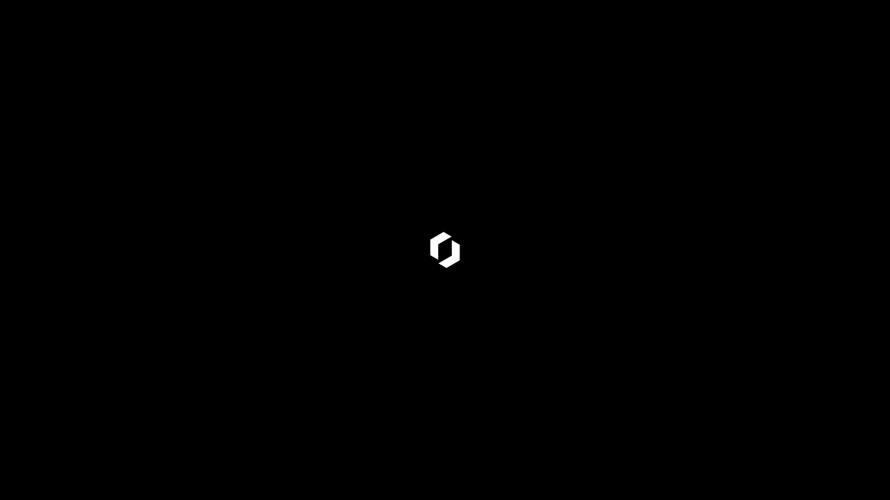
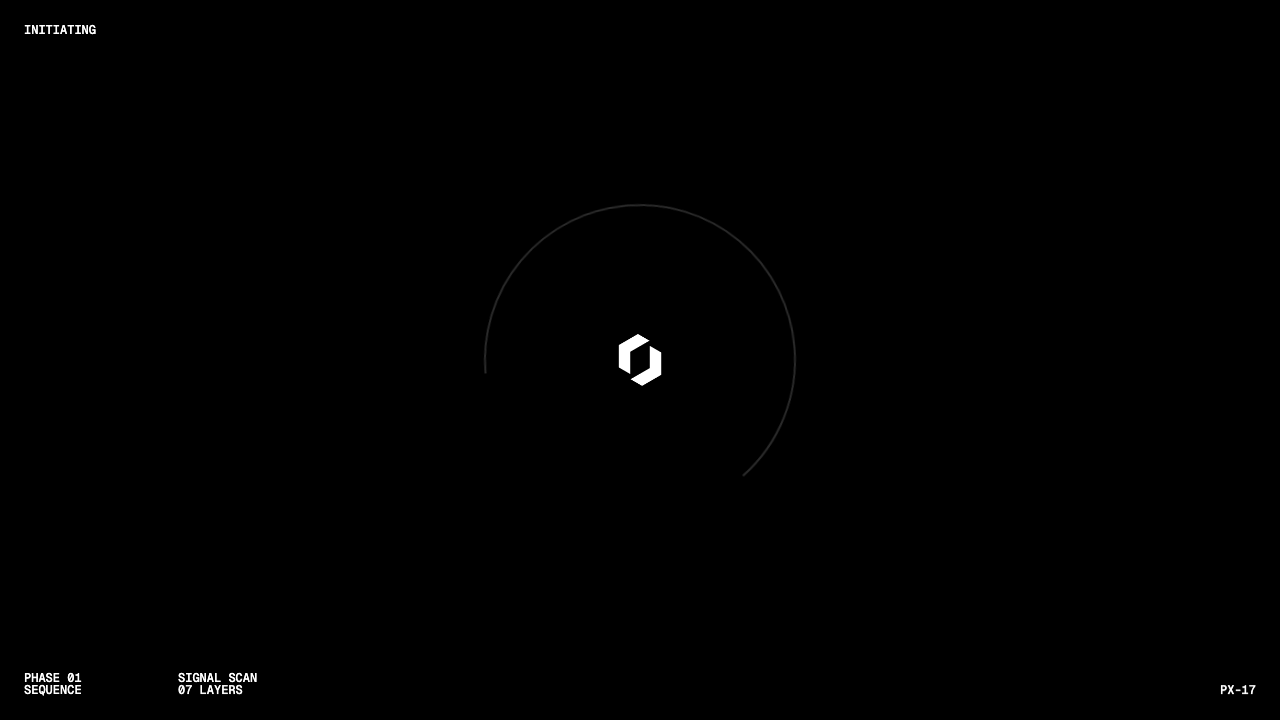
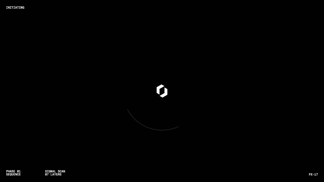
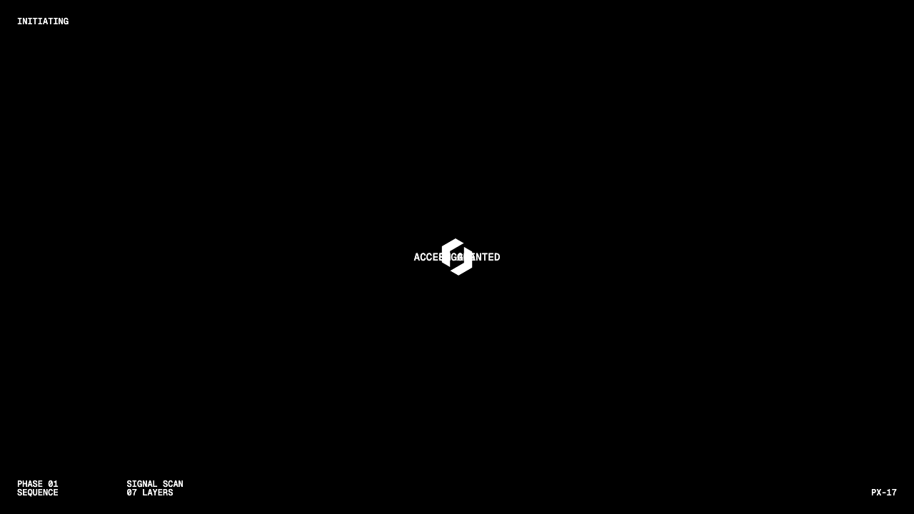
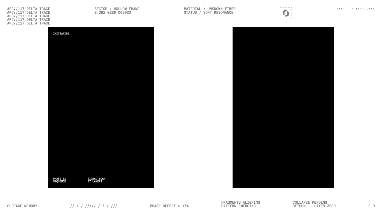
A full-screen preloader with a circular SVG progress indicator and animated text lines, that wipes off screen on click to reveal a scaled hero section. Uses GSAP SplitText, CustomEase, and clip-path polygon sweeps.
Prompt
Build a single-page preloader reveal animation using Vanilla JS, Vite, and GSAP. Use the following specifications exactly:

  ## Color & Typography
  - Light (--base-100): #ffffff
  - Gray (--base-200): #7a7a7a
  - Dark (--base-300): #000000
  - Font 1: "Barlow Condensed" weight 800, text-transform: uppercase, font-size: clamp(5rem, 15vw, 15rem), line-height: 0.8 — for the hero h1
  - Font 2: "Geist Mono" weight 500, text-transform: uppercase, font-size: 0.75rem, line-height: 1 — for all p elements
  - Load both fonts via Google Fonts @import in CSS

  ## HTML Structure
  Three stacked layers, all position: fixed, 100vw x 100svh:

  ### Layer 1 — Backdrop (.preloader-backdrop)
  - z-index: 0, background: var(--base-100), color: var(--base-200)
  - display: flex, flex-direction: column, justify-content: space-between
  - Two rows (.pb-row, padding: 1.5rem, display: flex, justify-content: space-between):
    - Row 1: 5 .pb-col elements with cryptic/hacker-aesthetic text + one #pb-logo img (2.5rem x 2.5rem, padding: 0.25rem, border: 1px dashed
  var(--base-200))
    - Row 2: 6 .pb-col elements aligned flex-end, with cryptic status strings
  - Mobile (max-width: 1000px): hide .pb-col:nth-child(1), :nth-child(2), :nth-child(5) in row 1

  ### Layer 2 — Preloader (.preloader)
  - z-index: 2, background: var(--base-300), color: var(--base-100)
  - display: flex, flex-direction: column, justify-content: space-between
  - clip-path: polygon(0% 0%, 100% 0%, 100% 100%, 0% 100%) — full coverage
  - will-change: transform, clip-path
  - Two rows (.p-row, padding: 1.5rem, display: flex, justify-content: space-between):
    - Row 1: <p>Initiating</p>
    - Row 2: left .p-col (display: flex, gap: 6rem, align-items: flex-end) with two .p-sub-col (each with 2 <p> tags), right .p-col with <p>PX-17</p>
  - Centered absolute .preloader-btn-container: width: 20rem, height: 20rem, top: 50%, left: 50%, transform: translate(-50%, -50%)

  ### Central Button (.preloader-btn-container)
  All direct children: position: absolute, top: 50%, left: 50%, transform: translate(-50%, -50%)
  - #pbc-logo: white logo image, width: 4rem, height: 4rem
  - #pbc-label: <p>Engage</p>, font-size: 0.9rem
  - #pbc-outro-label: <p>Access Granted</p>, font-size: 0.9rem
  - .pbc-svg-strokes (width/height: 100%, will-change: transform):
    - SVG viewBox="0 0 320 320", two circles r=155, cx=160, cy=160:
      - .stroke-track: stroke="#2b2b2b", stroke-width="2"
      - .stroke-progress: stroke="#fff", stroke-width="2"

  ### Layer 3 — Hero (.hero)
  - position: relative, width: 100%, height: 100svh, padding: 1.5rem
  - background: var(--base-300), color: var(--base-100)
  - display: flex, justify-content: center, align-items: center, text-align: center
  - transform: scale(0.75), will-change: transform
  - Children:
    - .preloader-revealer: position: absolute, inset: 0, background: var(--base-100), clip-path: polygon(0% 0%, 100% 0%, 100% 100%, 0% 100%), will-change:
   clip-path
    - <h1> (width: 90%): hero text content

  ## CSS Initial States
  ```css
  h1 .word,
  p .line {
    position: relative;
    transform: translateY(100%);
    will-change: transform;
  }

  JavaScript

  Setup

  import gsap from "gsap";
  import { SplitText } from "gsap/SplitText";
  import CustomEase from "gsap/CustomEase";

  gsap.registerPlugin(SplitText, CustomEase);
  CustomEase.create("hop", "0.9, 0, 0.1, 1");
  CustomEase.create("glide", "0.8, 0, 0.2, 1");

  DOMContentLoaded

  document.addEventListener("DOMContentLoaded", () => {
    let preloaderComplete = false;

    const preloaderBtn = document.querySelector(".preloader-btn-container");
    const btnOutlineTrack = document.querySelector(".stroke-track");
    const btnOutlineProgress = document.querySelector(".stroke-progress");
    const svgPathLength = btnOutlineTrack.getTotalLength();

    gsap.set([btnOutlineTrack, btnOutlineProgress], {
      strokeDasharray: svgPathLength,
      strokeDashoffset: svgPathLength,
    });

    document.querySelectorAll(".preloader p").forEach(p => {
      new SplitText(p, { type: "lines", linesClass: "line", mask: "lines" });
    });

    new SplitText(".hero h1", { type: "words", wordsClass: "word", mask: "words" });

  Entry Timeline (1s delay)

    const introTl = gsap.timeline({ delay: 1 });

    introTl
      .to(".preloader .p-row p .line", {
        y: "0%", duration: 0.75, ease: "power3.out", stagger: 0.1,
      })
      .to(btnOutlineTrack, {
        strokeDashoffset: 0, duration: 2, ease: "hop",
      }, "<")
      .to(".pbc-svg-strokes svg", {
        rotation: 270, duration: 2, ease: "hop",
      }, "<");

    const progressStops = [0.2, 0.25, 0.85, 1].map((base, i) => {
      if (i === 3) return 1;
      return base + (Math.random() - 0.5) * 0.1;
    });

    progressStops.forEach((stop, i) => {
      introTl.to(btnOutlineProgress, {
        strokeDashoffset: svgPathLength - svgPathLength * stop,
        duration: 0.75,
        ease: "glide",
        delay: i === 0 ? 0.3 : 0.3 + Math.random() * 0.2,
      });
    });

    introTl
      .to("#pbc-logo", { opacity: 0, duration: 0.35, ease: "power1.out" }, "-=0.25")
      .to(preloaderBtn, { scale: 0.9, duration: 1.5, ease: "hop" }, "-=0.5")
      .to("#pbc-label .line", {
        y: "0%", duration: 0.75, ease: "power3.out",
        onComplete: () => { preloaderComplete = true; },
      }, "-=0.75");

  Exit Timeline (click)

    preloaderBtn.addEventListener("click", () => {
      if (!preloaderComplete) return;
      preloaderComplete = false;

      const exitTl = gsap.timeline();

      exitTl
        .to(".preloader", { scale: 0.75, duration: 1.25, ease: "hop" })
        .to([btnOutlineTrack, btnOutlineProgress], {
          strokeDashoffset: -svgPathLength, duration: 1.25, ease: "hop",
        }, "<")
        .to("#pbc-label .line", { y: "-100%", duration: 0.75, ease: "power3.out" }, "-=1.25")
        .to("#pbc-outro-label .line", { y: "0%", duration: 0.75, ease: "power3.out" }, "-=0.75")
        .to(".preloader", {
          clipPath: "polygon(0% 0%, 0% 0%, 0% 100%, 0% 100%)",
          duration: 1.5, ease: "hop",
        })
        .to(".preloader-revealer", {
          clipPath: "polygon(0% 0%, 0% 0%, 0% 100%, 0% 100%)",
          duration: 1.5, ease: "hop",
          onComplete: () => gsap.set(".preloader", { display: "none" }),
        }, "-=1.45")
        .to(".hero", { scale: 1, duration: 1.25, ease: "hop" })
        .to(".hero h1 .word", {
          y: "0%", duration: 1, ease: "glide", stagger: 0.05,
        }, "-=1.75");
    });
  });

  File Structure

  /
    index.html
    script.js
    styles.css
    package.json
    /public
      logo.png           — dark version (backdrop row 1)
      logo-light.png     — white version (preloader center #pbc-logo)

  package.json

  {
    "scripts": { "dev": "vite" },
    "dependencies": {
      "gsap": "^3.14.2",
      "vite": "^8.0.0"
    }
  }

  Technical Notes

  - SplitText requires GSAP Club (Business Green or higher)
  - preloaderComplete boolean gates the click — prevents triggering exit before entry finishes
  - Wipe direction is left: both .preloader and .preloader-revealer animate from polygon(0% 0%, 100% 0%, 100% 100%, 0% 100%) to polygon(0% 0%, 0% 0%, 0%
  100%, 0% 100%)
  - .preloader-revealer is a white overlay INSIDE .hero — it masks the hero until the black preloader wipes off, then itself wipes off to reveal the dark
  hero beneath
  - All .preloader p elements are SplitText-split, including #pbc-label and #pbc-outro-label
  - Hero starts at scale(0.75) and expands to 1 via the exit TL offset "-=1.75" (runs concurrently with the wipe)
  - The SVG track draw and SVG rotation both start at "<" (same time as the lines stagger)